Design Your GivingFlow
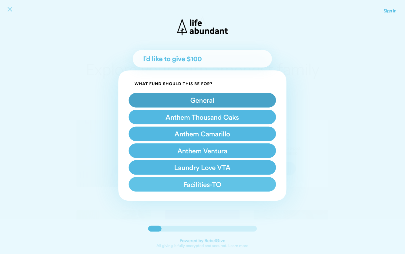
Instead of lengthy forms, RebelGive accepts donations through GivingFlows. Rather than demanding a donor’s information all at once in a tedious full-length or expanding form, RebelGive only asks for one piece of information at a time, step-by-step 👣
Below is an example of what a GivingFlow looks like. Because donors can access your GivingFlow from any page on your website, customizing the look and feel of your GivingFlow is important to make sure it matches your church's brand and style.

Design Your Giving Flow
To access the Design page in your Control Center, click on GivingFlow in your main menu in your Control Center, and then choose Design. Or click here.

Upload Your Logo
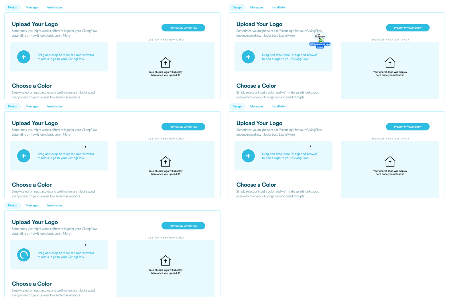
To get started with customizing your GivingFlow, you'll want to upload your logo by clicking on the + (plus) button, or by dragging and dropping, as shown below 👇

Here are a couple things to keep in mind:
- Your logo should be in PNG format. This usually means that the background is transparent and that there isn't a white background.
- The dimensions of your logo should be at least 400 px wide to appear clear on all devices.
- Ideally, your logo should match the same one used on your website.
You'll be able to preview your logo on the example GivingFlow to make sure it's just right 👌

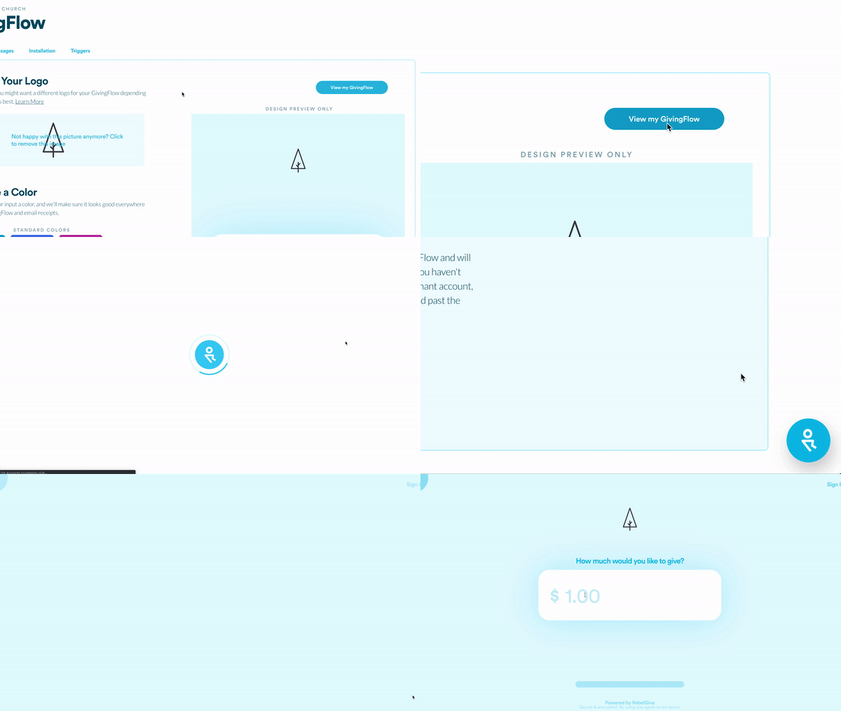
If you want to get a true preview of your entire GivingFlow, click on the blue Preview My GivingFlow button in the top right corner.

Selecting A Color
To make sure the GivingFlow matches your church's colors, select the one that fits best under the Choose a Color section. You can choose between a standard color or by entering a hex code. (If you don't know what your exact color is, you can find it here by entering your church website or can choose one here.)
In addition to selecting a color, you can choose between light and dark mode for a different style.
NOTE: By design, the color selector will pull the main hue from the color you input and will give you a light and dark option that'll look great! So it won't be the exact color of the hex code you selected, but rather a custom calibrated set of five tints that'll look good and keep your content legible.
Position Your Give Button
If the position of your GivingFlow Trigger doesn't look quite right on your website, you can make these changes in the Control Center.
You can edit these settings from the Installation section of the GivingFlow tab.
The position of the GivingFlow Trigger is normally set on the right side of the page, but can be moved to the left. If you need to move it more, you can enter the exact bottom and side offset at the bottom of this section.
